
Now I’ve never been a huge fan of technical analysis. But I recently came across this really great introduction to Technical Analysis by Saxo that I thought was well worth the read. The piece explains simple moving average, trend lines, RSI, bollinger bands & volume. It has been reproduced below in its entirety, with Saxo’s permission. Enjoy!
And just in case you missed it, Saxo Markets is a pretty attractive stock broker for Singapore investors these days, with 4 USD minimum commission on US trades (versus 25 USD for most other brokers like DBS Vickers and UOB Kay Hian), and 10 SGD minimum commission on SGD trades (in line with most other cash upfront brokers like DBS Vickers Cash Upfront). Check out my previous reviews on using Saxo for Singapore shares and International Shares.
Financial Horse x Saxo Affiliate Link
If you’re keen on opening a Saxo account, Financial Horse has partnered with Saxo for a special affiliate promotion:
Financial Horse Affiliate Link for Saxo account
For the full details, drop me an email at [email protected] !
Courtesy of Saxo Markets:
Technical Analysis Explained: Five tools to enhance your trading in volatile markets
Often considered the method of choice for more advanced traders, technical analysis is a set of tools that all investors and traders could benefit from. In essence, it is the concept of interpreting market movements to better understand market sentiment, identify trading opportunities and managing risk.
On the back of one of the longest bull markets in history and with increasing market turmoil from geopolitical events and growing recession fears in financial markets, technical analysis is becoming even more relevant to gauge a specific instrument or market direction as a method to get a sense of direction in a specific instrument or the broader market and enhance risk management in volatile markets.
From Japanese rice traders in the 17th century, the concept of technical analysis has since then evolved, and is along with fundamental analysis the leading schools of thought when investors analyse the future direction of financial markets.
Where fundamental analysis is made by examining the key ratios of a business, the technical analysis is based on historical data from charts to see where the market is heading. When making an in-depth analysis it therefore makes sense to have both methods supplementing each other instead of choosing one over the other.
“We can clearly see that technical analysis is increasing in popularity. Some rely solely on technical analysis in their trading endeavours whereas others use it as a supplement to the more fundamental analysis. Some tend to misunderstand what it is about, but technical analysis is very simple in its core, and is all about leveraging data to strengthen one’s risk management in terms of when to enter and exit a trade.” says Kim Cramer Larsson, technical analyst at Saxo Markets.
“There is a lot of focus from traders and market participants on signals that could indicate when we will face a global recession. Looking the S&P500 chart for key levels, a weekly close below 2728 could fuel a sell-off, that could take the index down to around 2350 which is about 20 percent below its current level. If it then goes further down and closes at 2346 it tells me, that the long uptrend is likely over and we could likely be in for a major correction.”
The danger of falling in love with a trade
The market is over-flooded with information and it is human behaviour to filter out the stories that we do not like and place greater confidence in the sources we like. Adding this to the common notion that many investors tend to follow a few companies or indices very closely makes it very easy to fall in love with one’s position.
“It is very easy to take greater and greater risk when holding a losing position. And unfortunately, this often makes us change our investment horizon when holding a losing position hoping it will bounce back tomorrow. And to avoid the negative feelings of having a losing position we often add to that position to bring down the average price and thereby the loss in percentage. These actions are driven by emotions and can be eliminated by using some of the tools from technical analysis tools to set a proper stop-loss that is integral to an investor’s approach to risk management,” says Kim Cramer Larsson. He has been studying investor psychology for years and sees many people making this exact mistake.
The importance of trends
When using technical analysis, observing trends is an important discipline. In short, a trend can be described as the general direction of the market during a specified time period. Trends can be both bullish and bearish, and the length may vary between hours and months. Utilising trends can help investors piece together a full investment overview and give indications when to invest – and when not to.
5 technical analysis tools and how to use them:
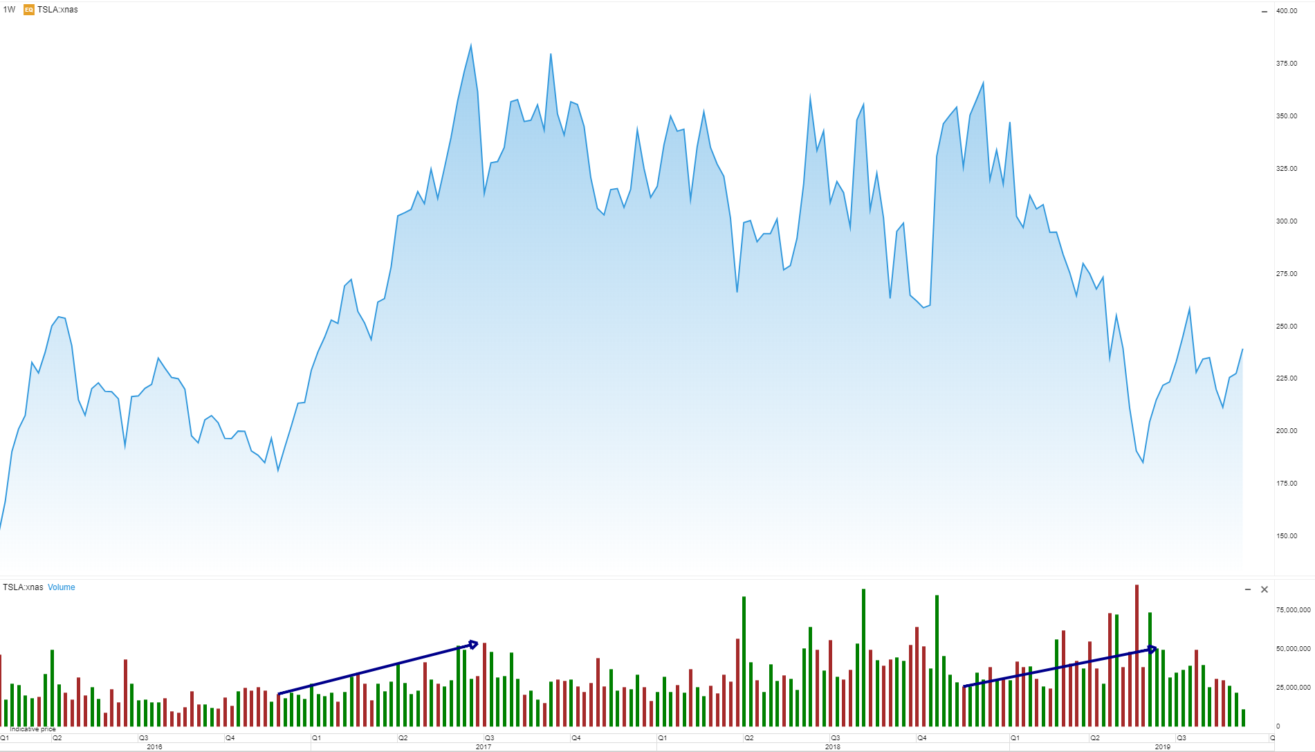
Simple Moving Average
A simple moving average is a useful tool to analyse the trend of a security since it smooths out price movements and reduces ‘noise’. It is calculated by adding the closing price of a security for a distinct amount of time – usually 20, 50 or 200 days – and then dividing this total by that same number. A shorter amount of days will lead to more volatility. When using a simple moving average, you look for the time when the two moving averages cross which is usually referred to as either a ‘death cross’ or a ‘golden cross’. While these can be used to see a coming trend, they are not the strongest signals as the simple moving average is a lagging indicator.
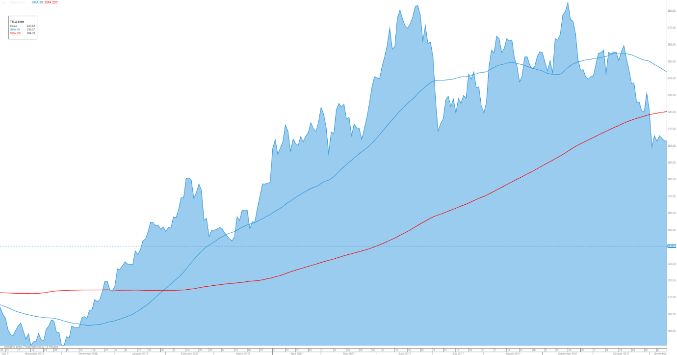
BULLISH SIGNAL:
The golden cross occurs when the 50-day simple moving average crosses above a rising 200-day moving average. This is considered a sign of a bullish market and a buying indicator. Here it is exemplified by the Tesla stock, where the golden cross occurred in the beginning of 2017 marking the starting point of a positive trend in the stock price.
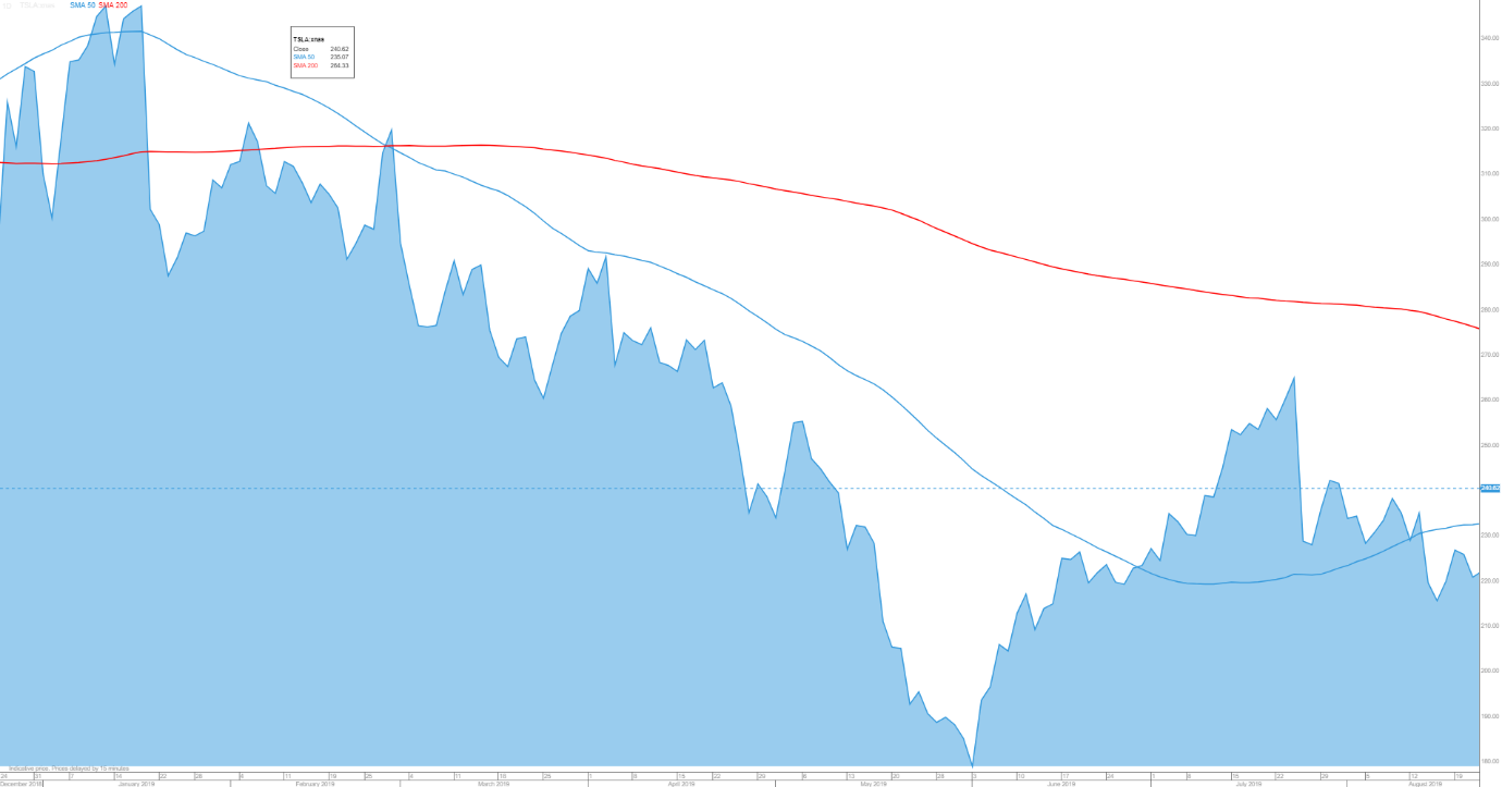
BEARISH SIGNAL:
A death cross is when the 50-day simple moving average curve crosses below a falling 200-day moving average. This is a sign of a bearish market, which could indicate it is time to sell. In this chart, the 50-day average crossed below the 200-day line (in red) indicating a longer downward trend throughout the year.
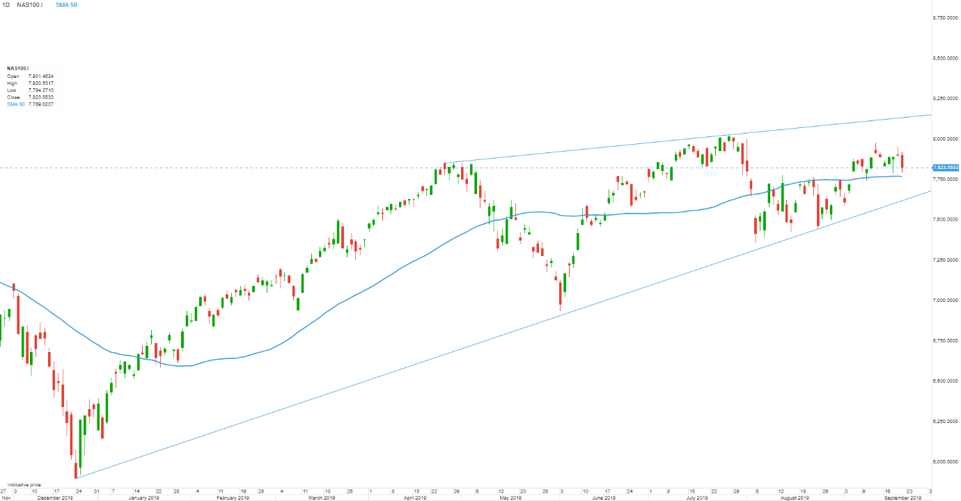
Trend lines
Knowing when to buy or sell can be difficult. Setting up trend lines is a way of developing indications on when to buy, and when to cut your losses. Trend lines are made by making a line from between two or more price points either high points or low points to draw the resistance and support line.
BULLISH SIGNAL:
The upper trend line is the resistance trend line. When the price breaks the resistance line, it could indicate a positive trend for that given instrument and signals a buy signal. In this example it would mean the NASDAQ 100 index would have to break through 8100.
BEARISH SIGNAL:
The lower price points form the support trend line. It is to set stop-losses or identify short opportunities. If an instrument suddenly breaks the support line, it is often a bearish signal and indicates a price where the investor would typically benefit from cutting the loss rather than holding onto a falling knife. In this example it would mean the NASDAQ 100 index crossing below 7600.
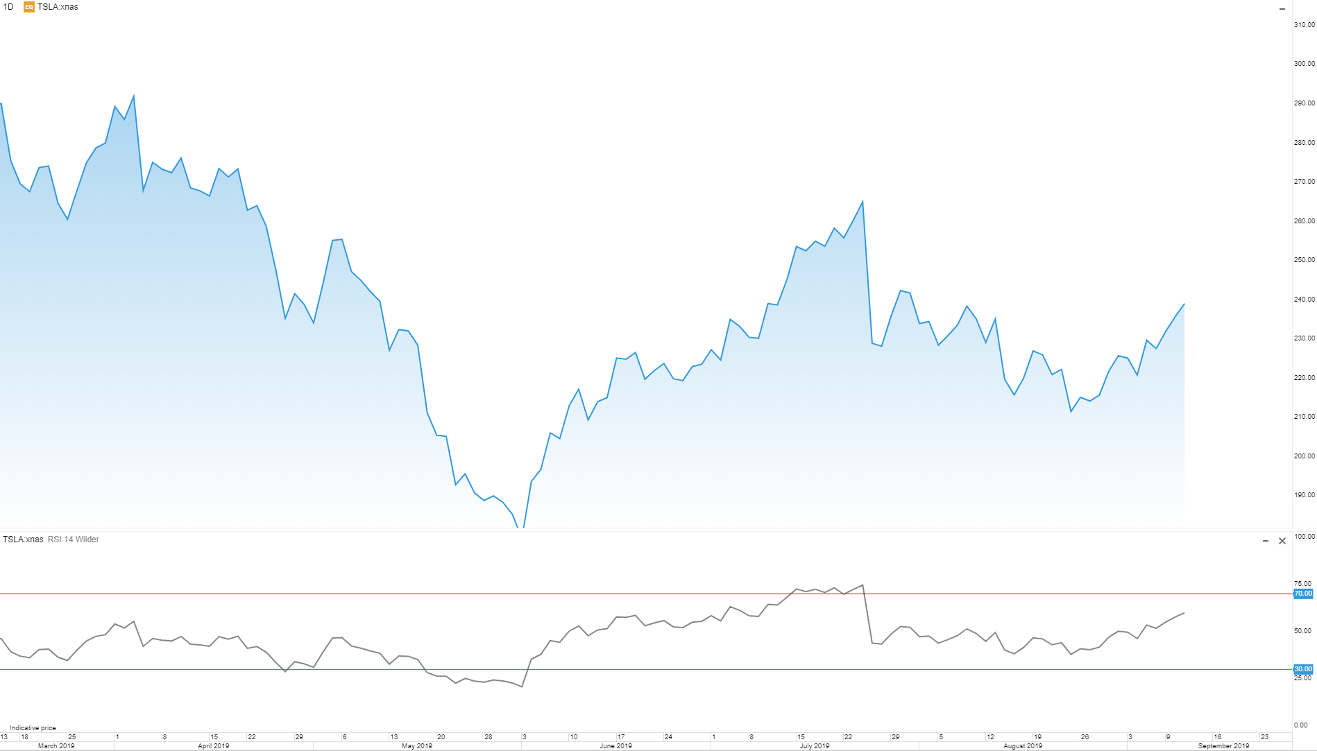
Relative Strength Index (RSI)
RSI is a momentum indicator ranging from 0-100 showing the relations between the latest movement in the market. This can help to indicate whether an asset is being overbought or oversold.
BULLISH SIGNAL:
When the indicator is between 0-30, it means the asset is being oversold, meaning it might be time to buy up before the trend is turning. In the case of Tesla, which happened in May, when the RSI dipped below 30 before bouncing back up in the coming months.
BEARISH SIGNAL:
If the indicator is placed between 70-100, it shows the asset is being overbought. This means it might be the right time to withdraw before the trend turns. In the Tesla example, that is exemplified in July when the RSI went above 70, which marked a turn in trend.
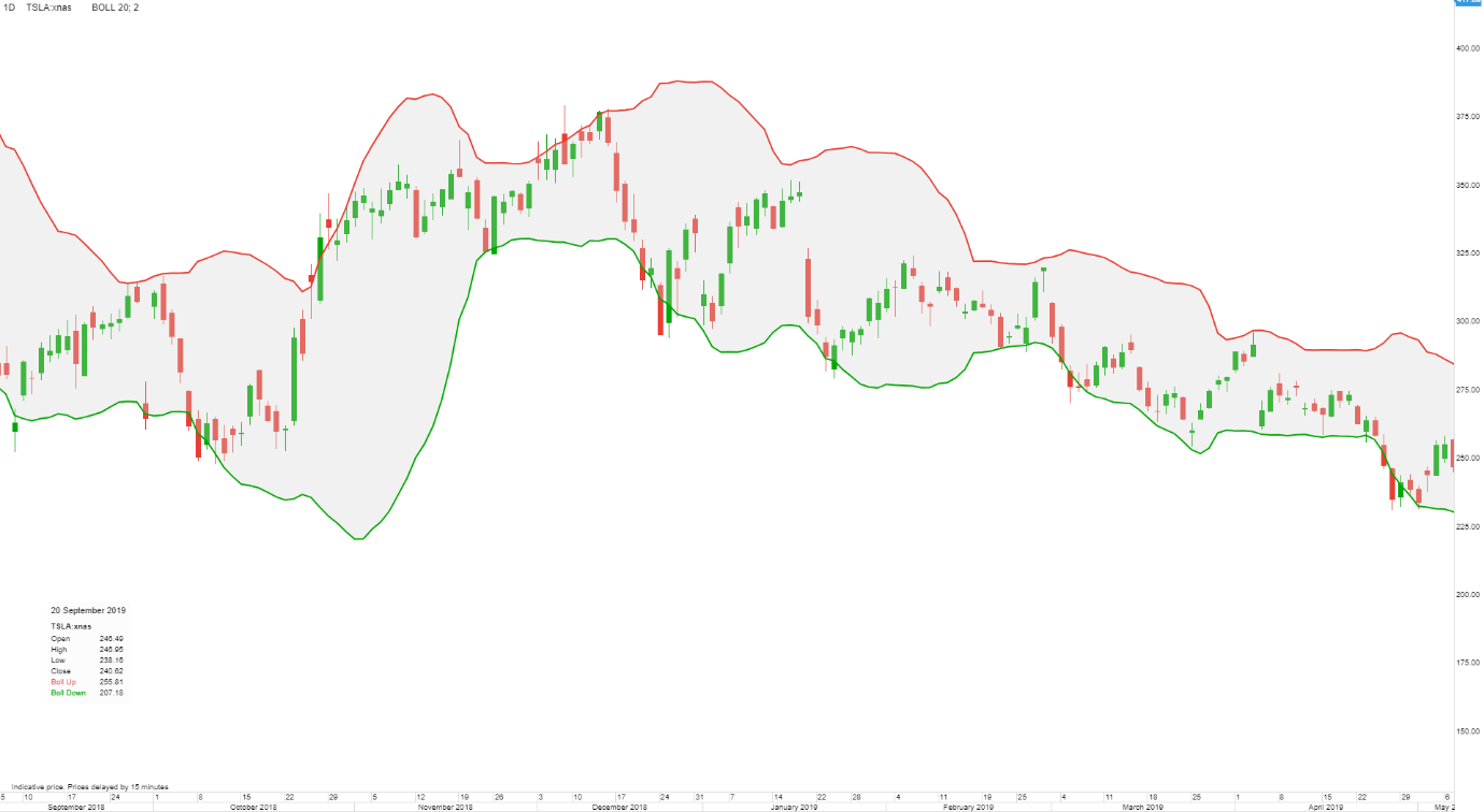
Bollinger bands
Bollinger bands are used to follow market volatility and provide indicators on when to sell or buy. Bollinger bands consist of a simple moving average with one band above and one band below showing the standard deviation, indicating how prices are dispersed around an average value. As volatility either increases or decreases, the bands move along. If the volatility is high, the bands expand – and if the volatility is low the bands contract.
BULLISH SIGNAL:
A sharp move penetrating the upper band is usually a bullish signal. In this example the Tesla stock penetrated the upper band in October, marking the start of a bullish trend throughout the next month.
BEARISH SIGNAL:
If there is a sharp move towards the lower band, it is a bearish signal. In December 2019, the Tesla stock penetrated the lower band. This indicated a bearish trend in the following months.
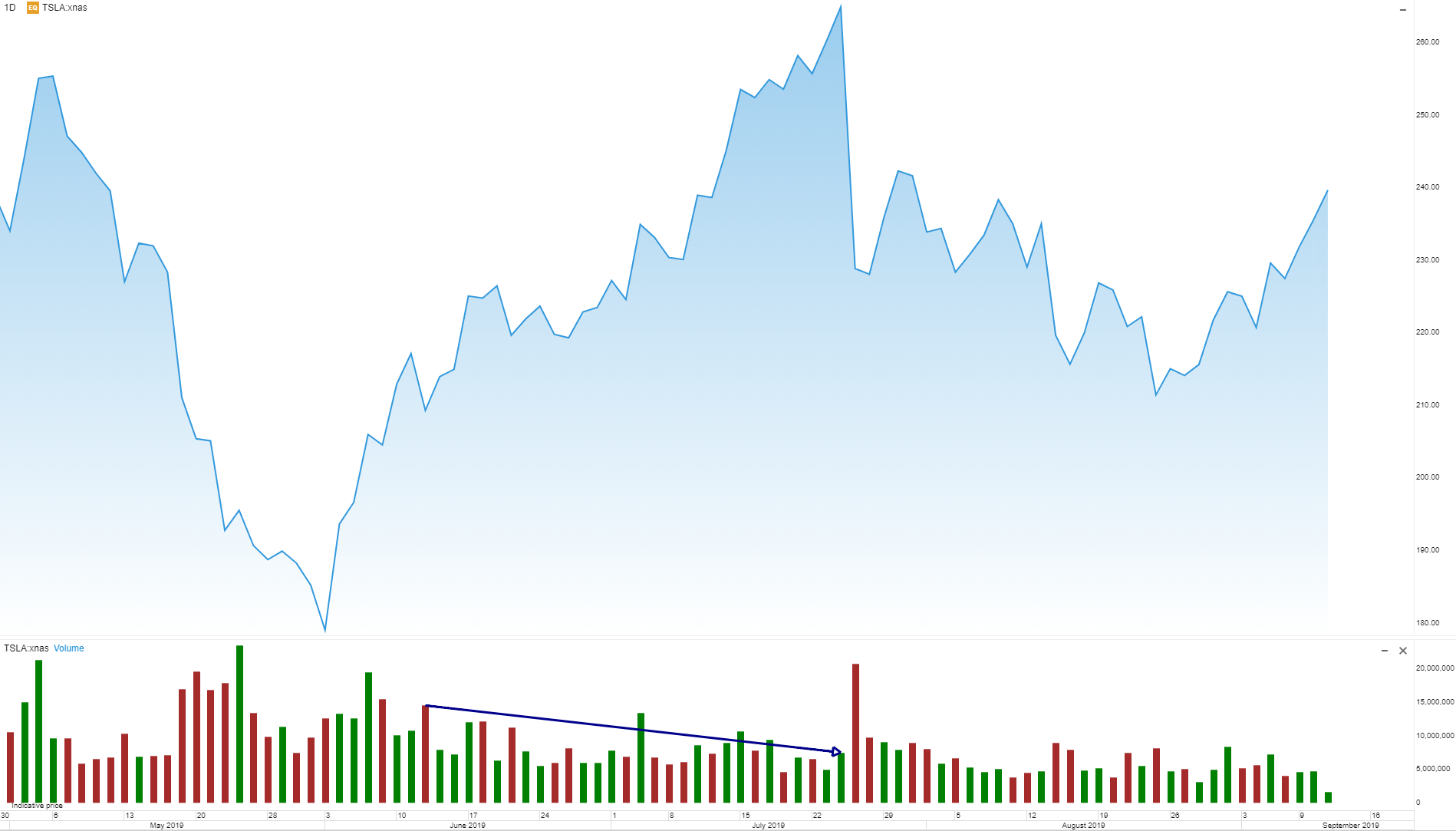
Volume
Keeping an eye on the trading volumes can indicate when the market is about to go up or down – giving insights on when to buy or sell. The volume increases when investors buy or sell a certain asset and decreases when it is not being traded. Price and volume always go hand in hand since there is no market without price movement, and there is no price movement without volume. Volume represents balance of supply and demand that moves prices up and down.
BULLISH SIGNAL:
When price and volume is falling, it is a trend confirmation, and a sign of exhaustion – which could lead to a down trend.
BEARISH SIGNAL
Likewise, if price is rising but volume is falling, it is also confirmation of a trend developing. This is a sign of exhaustion, which could lead to an uptrend.
Looking for a comprehensive guide to investing? Check out the FH Complete Guide to Investing for Singapore investors.
Support the site as a Patron and get market and stock watch updates. Like our Facebook Page and join the Facebook Group to continue the discussion!